The long way round
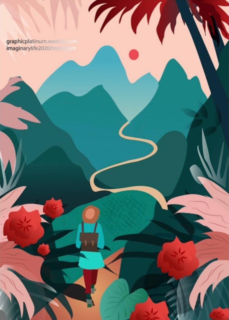
A flat-vector poster series about walking into places that don't have a map yet. Layered mountains, a single winding path and a palette that shouldn't work — teal, coral and blush — but does.
I'm Hira Bostan — illustrator and graphic designer. Art has always been my way of expressing stories, emotions and ideas: brand identity, packaging and illustration for people who'd rather be noticed than fit in.
Scroll through and the background changes to the colour that defined each brief. Flat vector illustration, luxury branding, book covers and shop builds — all in one place.
A flat-vector poster series about walking into places that don't have a map yet. Layered mountains, a single winding path and a palette that shouldn't work — teal, coral and blush — but does.
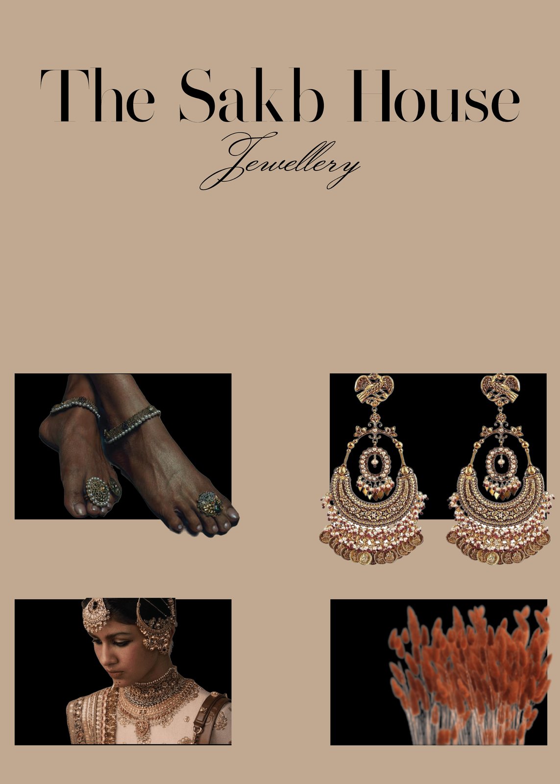
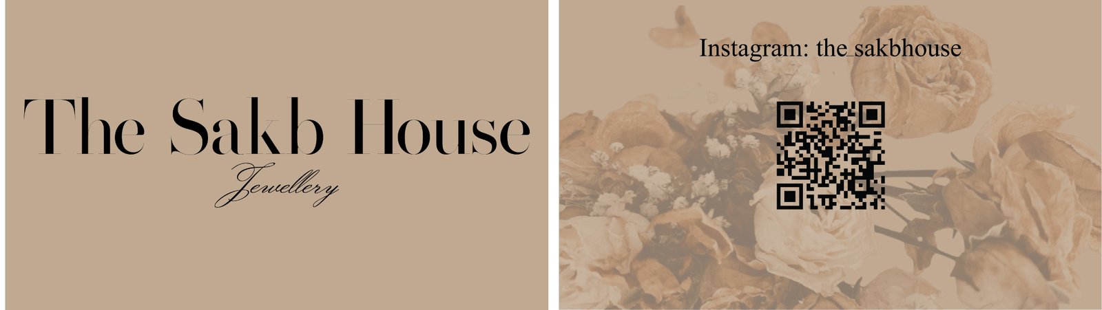
Brand identity for a South Asian bridal jewellery house. A high-contrast Didone wordmark paired with a hand-lettered script, set against warm sand so the gold does the talking. Delivered as lookbook pages and a double-sided business card.
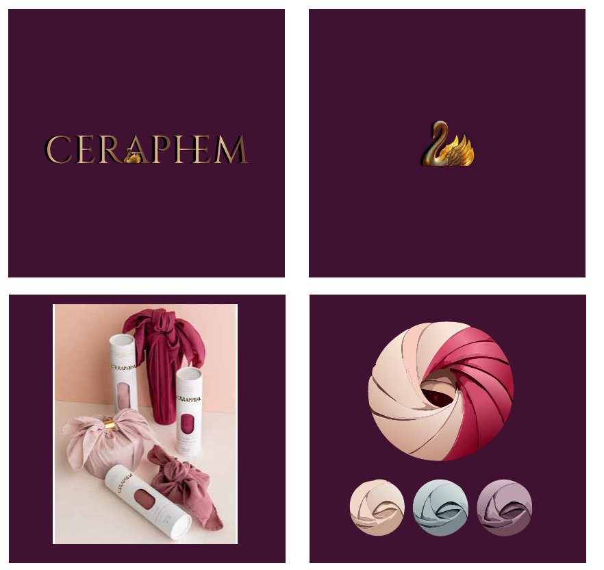
Logo, swan mark and packaging system for a silk hair-accessory brand. The signature is a twisted-fabric emblem that recolours across the range — blush, sage, mauve — so each SKU is recognisable on the shelf from across the room.
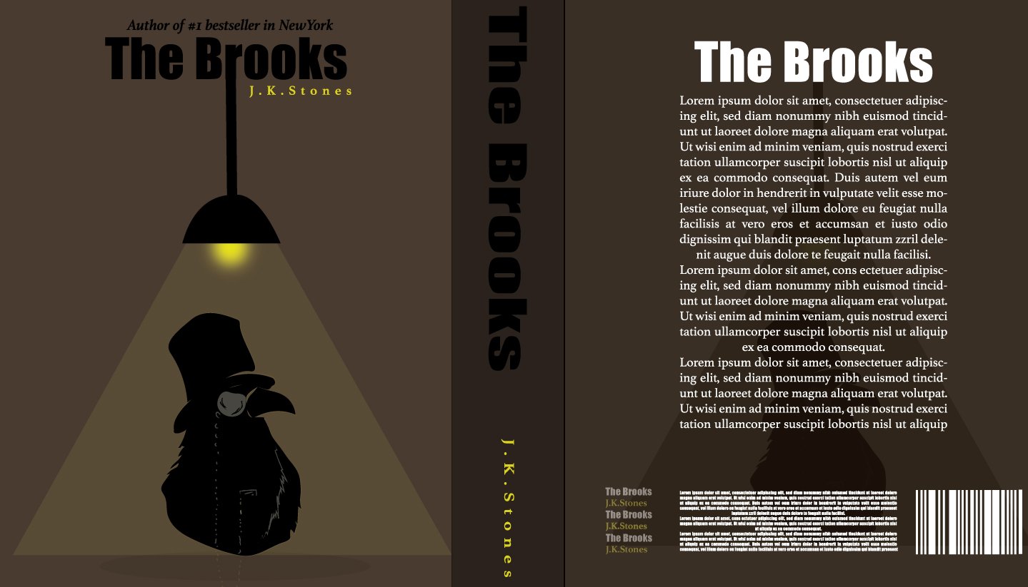
Full-wrap book cover for a noir thriller — front, spine and back. One light source, one silhouette, one colour that isn't brown. Everything else stays in shadow.
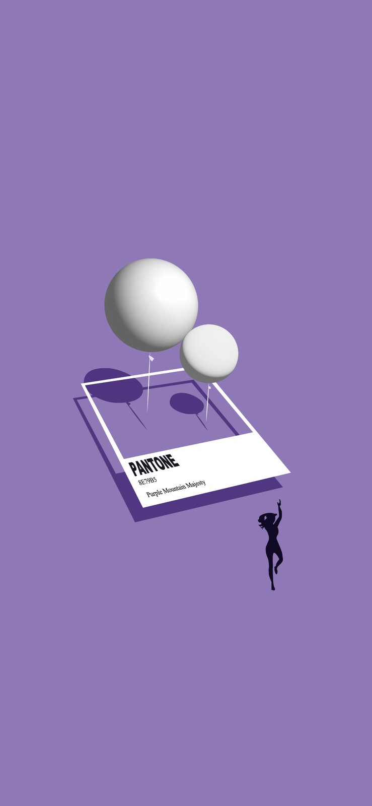
A phone wallpaper built around a single Pantone chip. Balloons cast shadows on a swatch that doesn't exist, and a small figure reaches for them. Minimal, but every shadow was placed by hand.
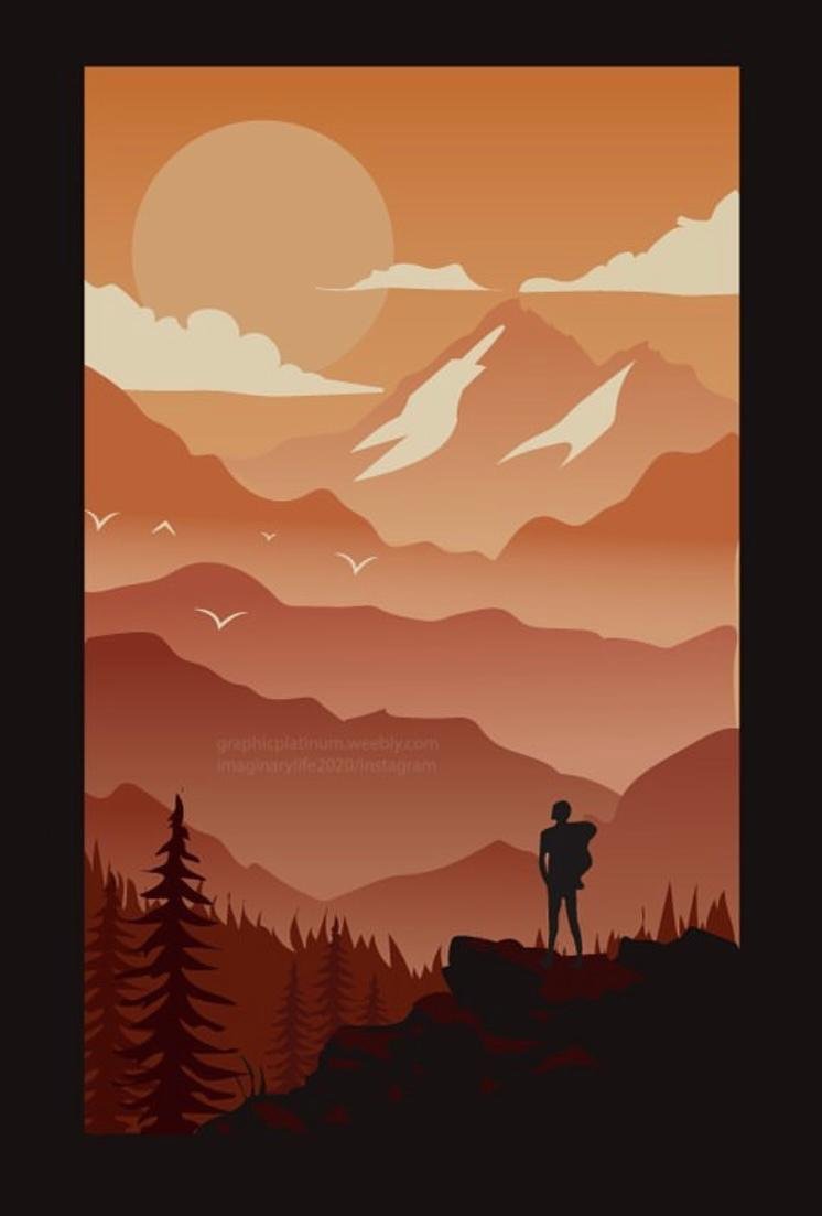
Eleven shades of orange, stacked into mountain ranges. A study in atmospheric depth using nothing but tone — the further away a ridge is, the closer it gets to the sky.
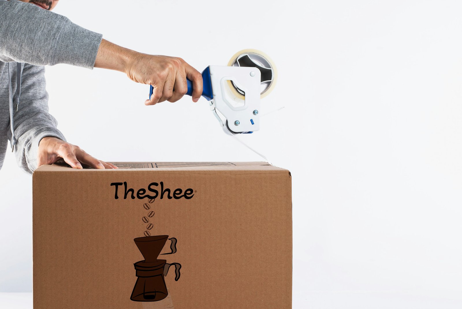
Logo and shipping-box print for a small-batch pour-over roaster. Beans fall from the wordmark straight into the dripper — the whole brand story in one line drawing that prints in a single colour on kraft.
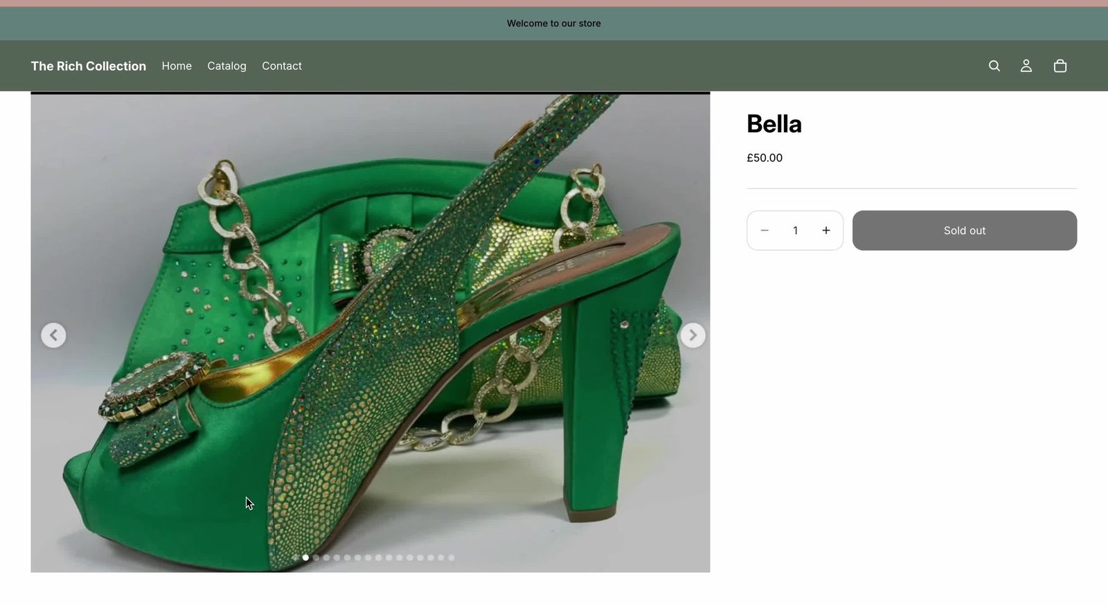
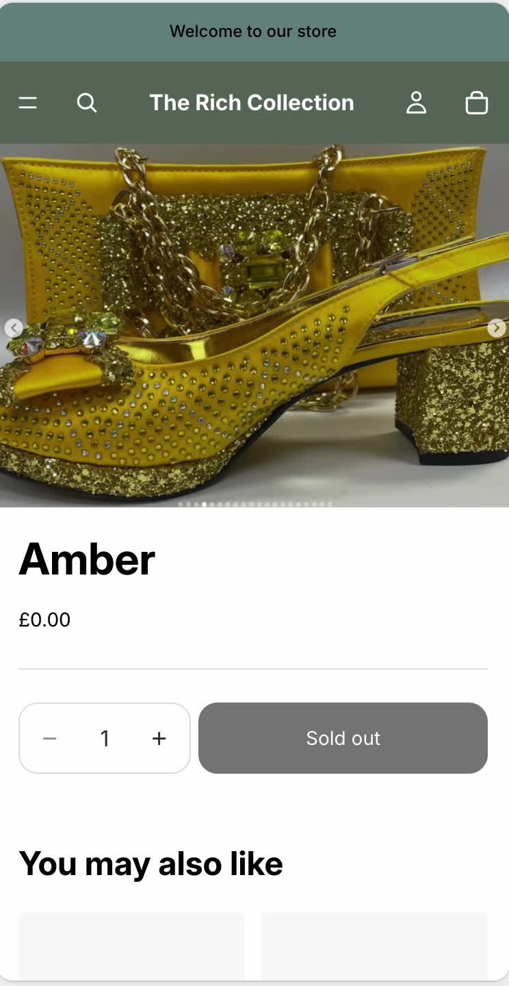
Shopify storefront for a luxury occasion-wear boutique. Product photography direction, theme customisation and a mobile-first layout so the shoes look as good on a phone as they do in the window.
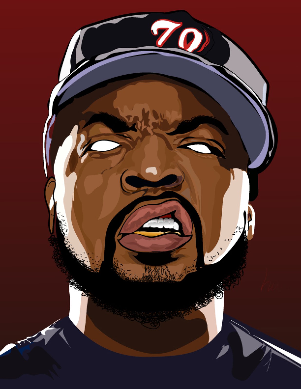
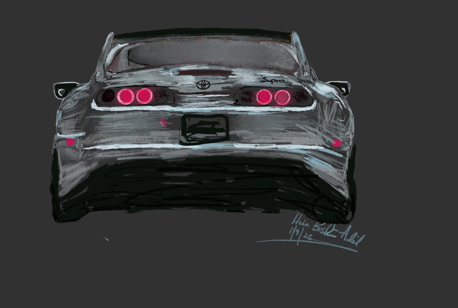
Digital painting and drawing — a Supra from behind, a skull, portraits built from grain and a single colour. Heavier and darker than the client work, and the place where the brushwork gets pushed.
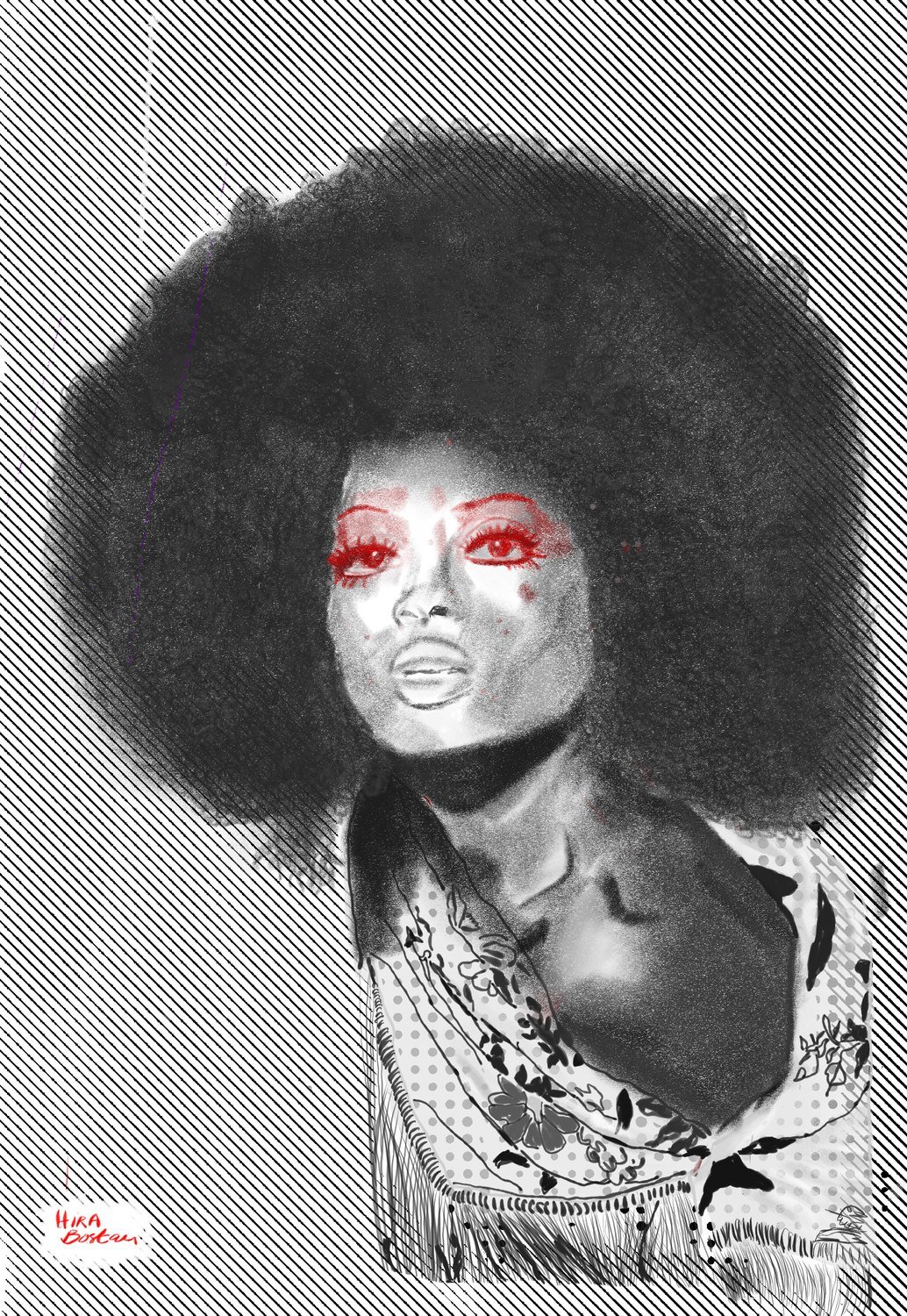
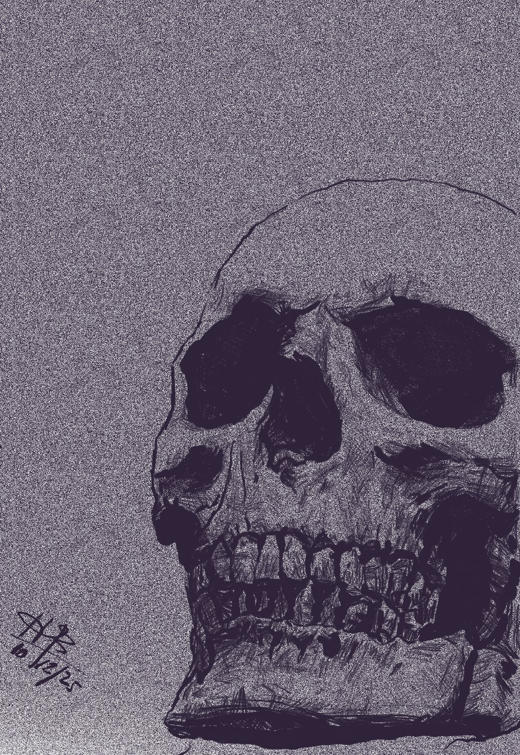
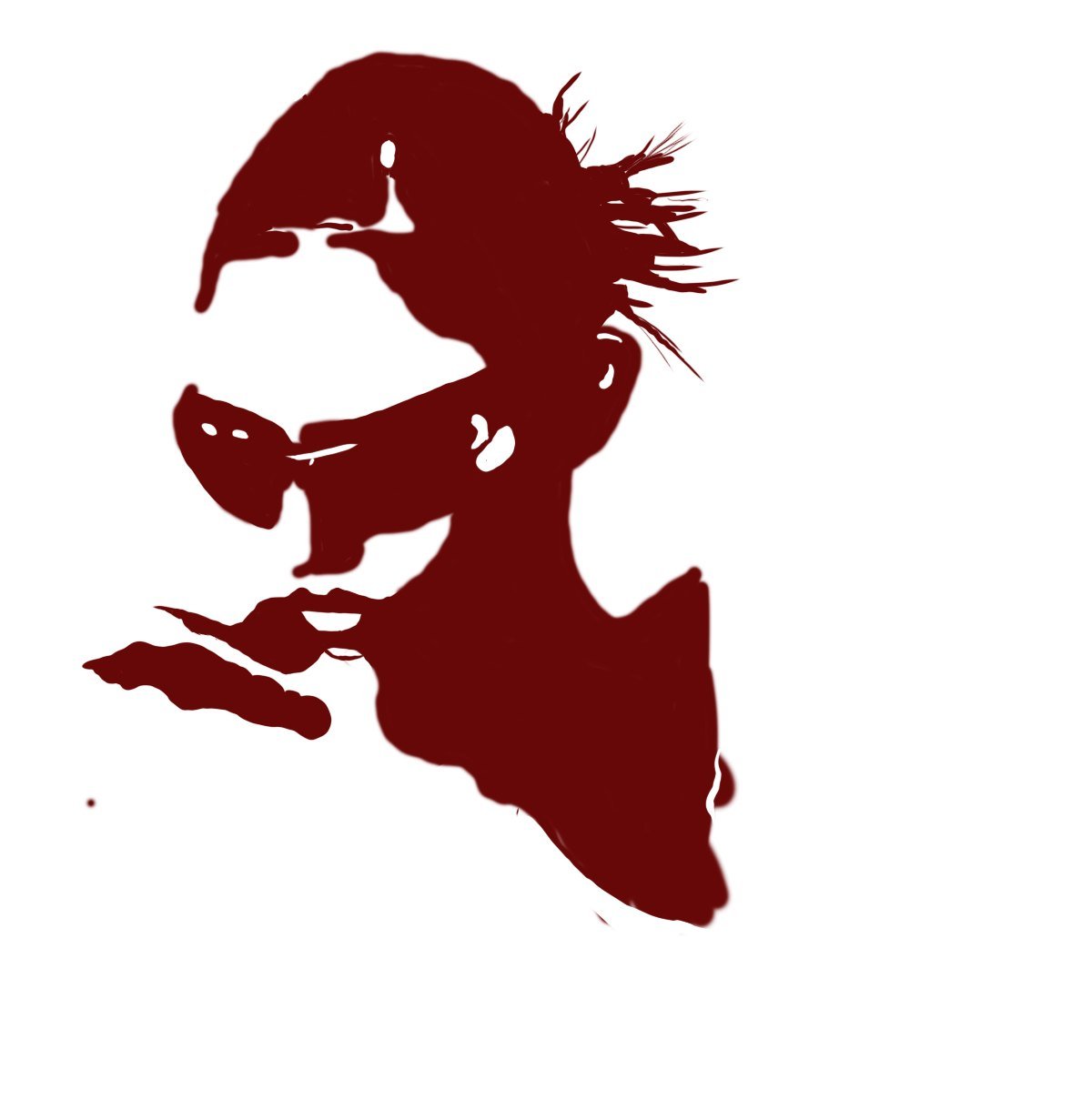
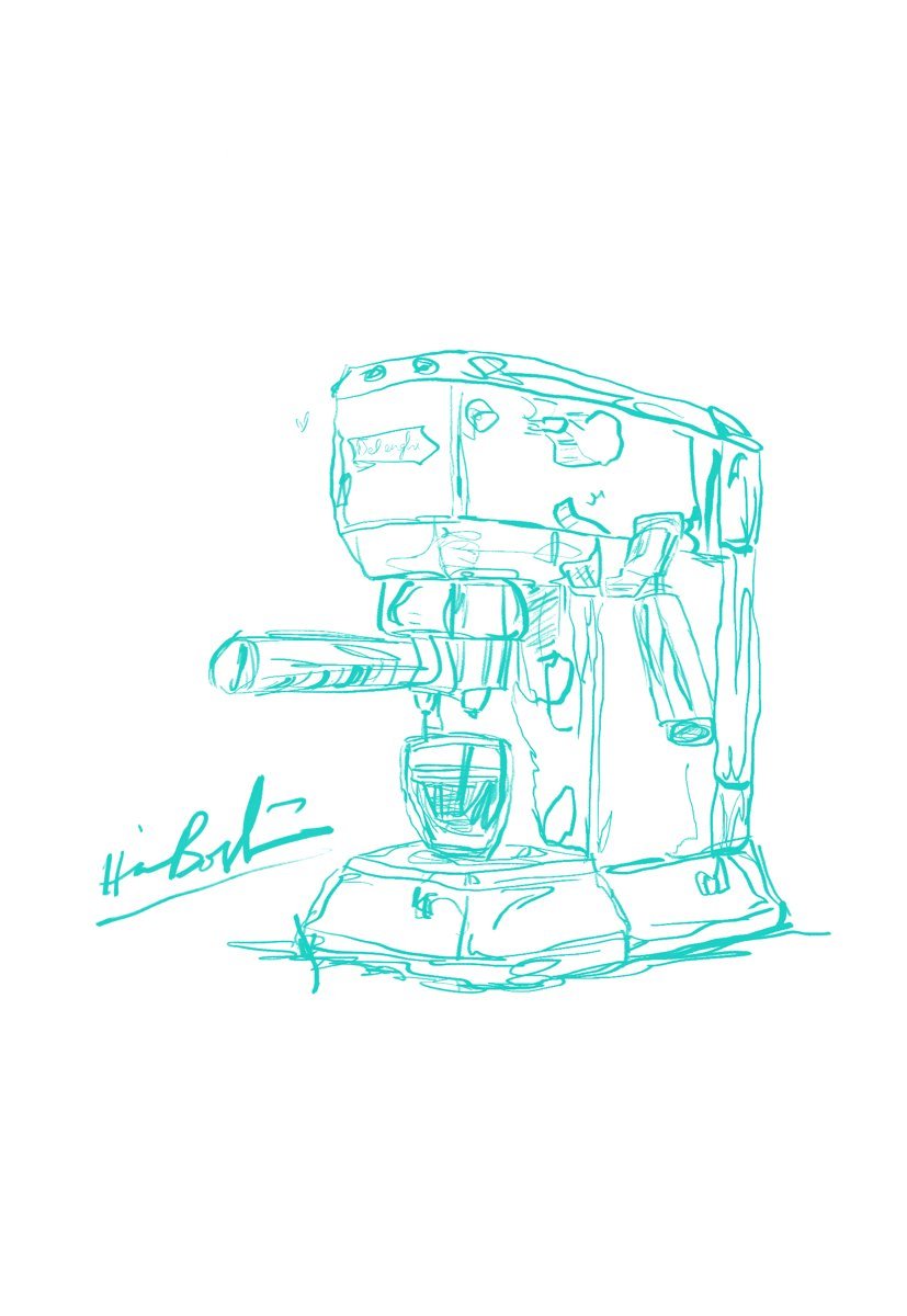
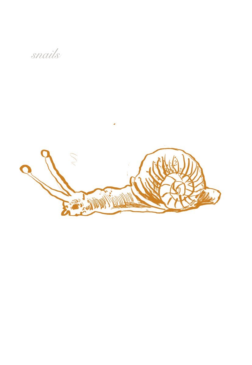
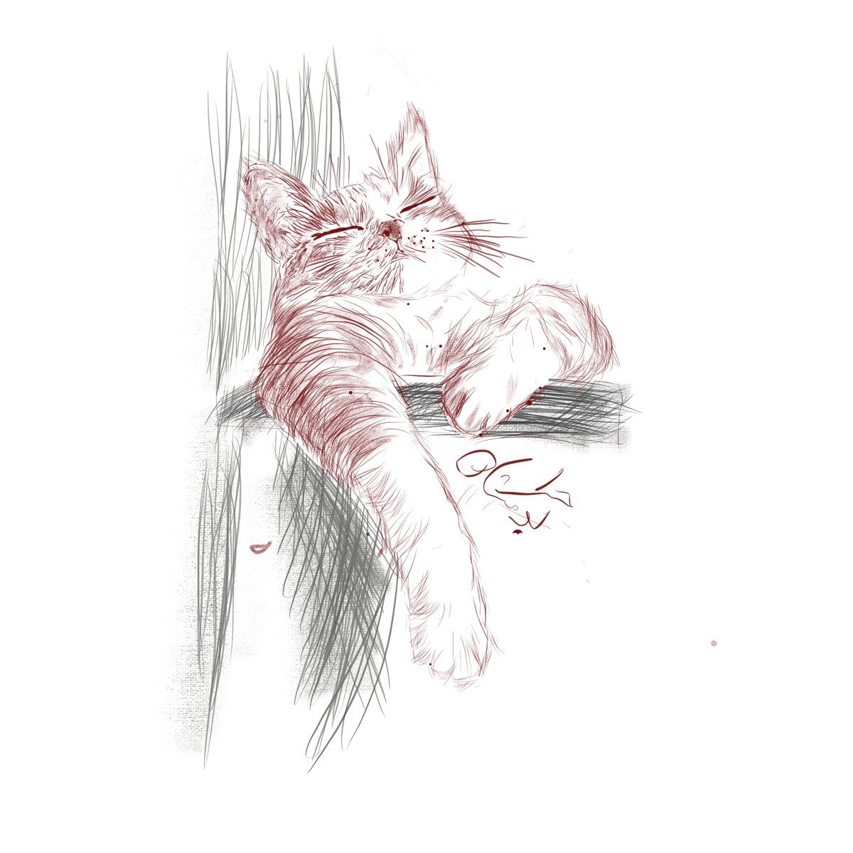
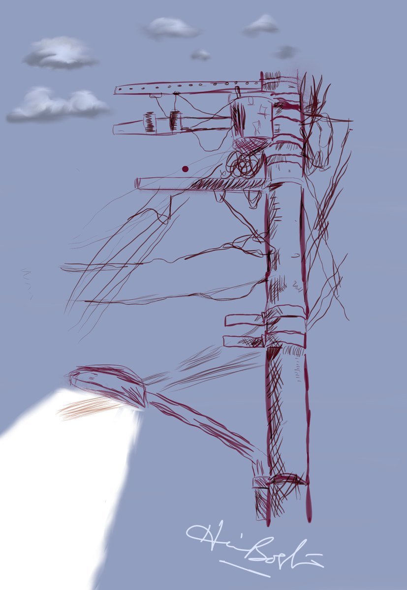
Quick daily drawings on the iPad — no undo, no cleanup. A coffee machine, a snail, the cat that lives on the wall, whatever was in front of me. This is where the illustration work starts.
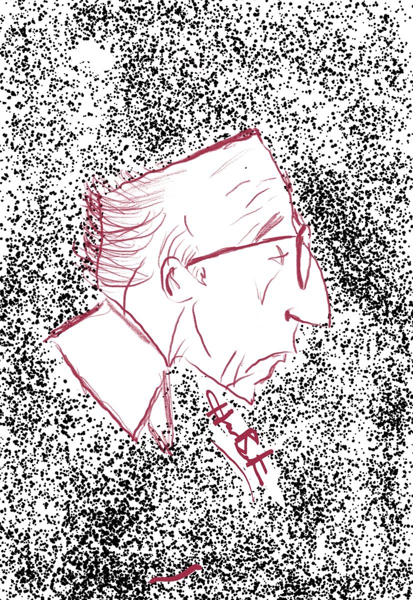
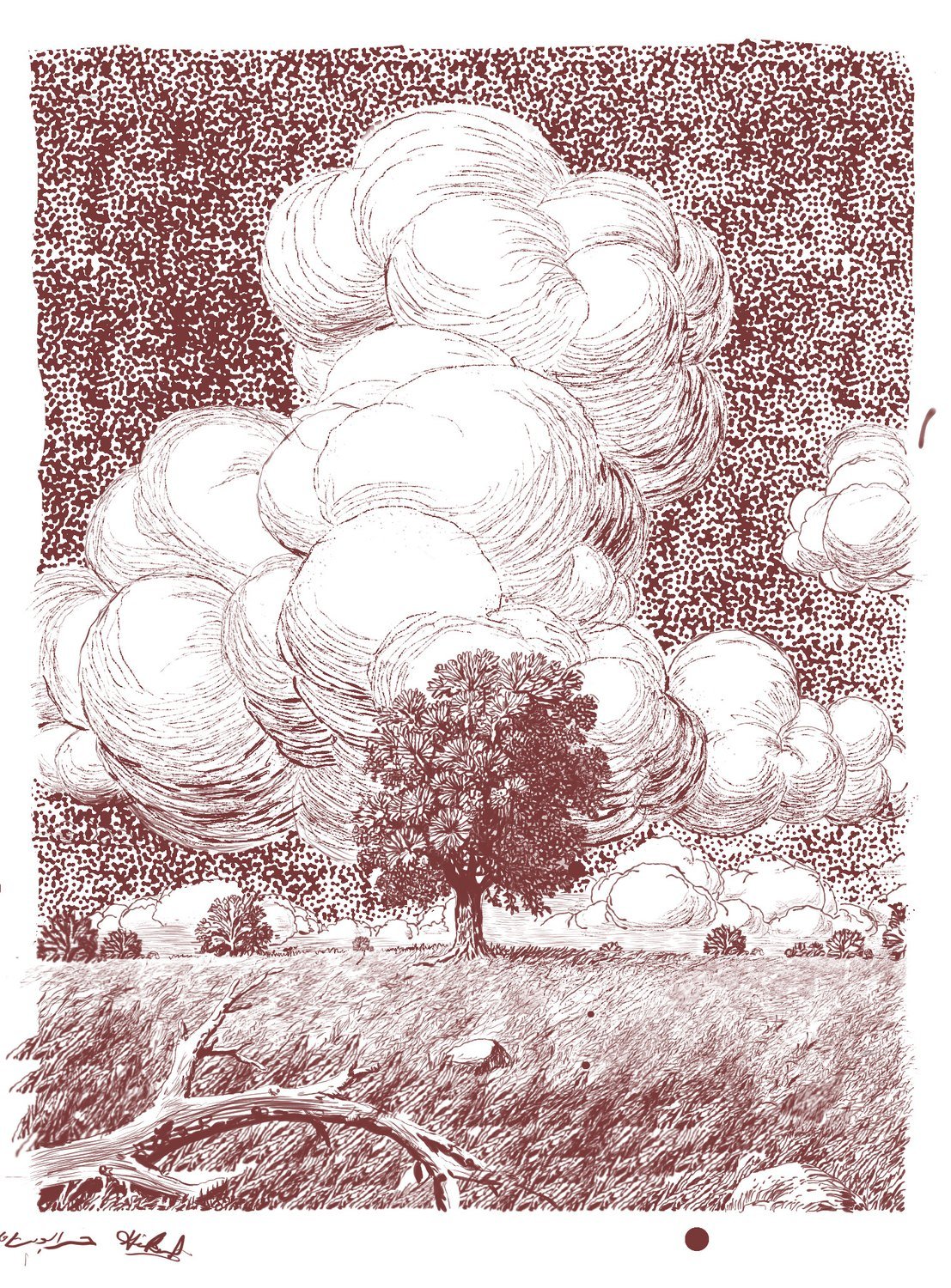
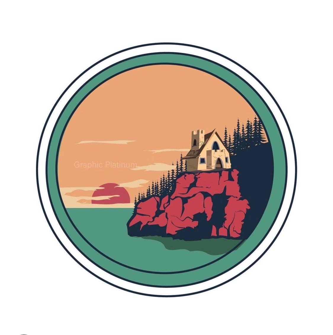
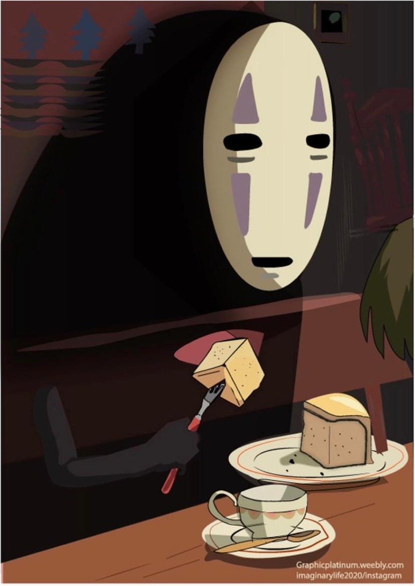
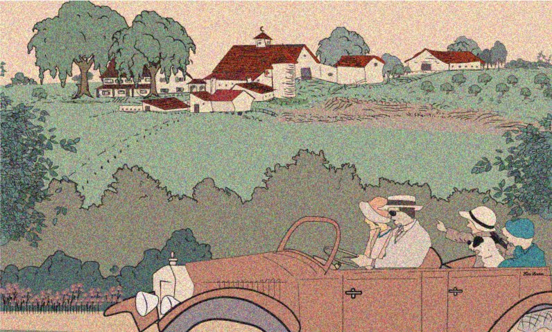
Character work, badges, fan pieces and logos. Mostly vector, occasionally grainy on purpose.